Trustly, the global specialists in online banking payments, has revealed its new visual identity, including a logo, colour palette and typeface.
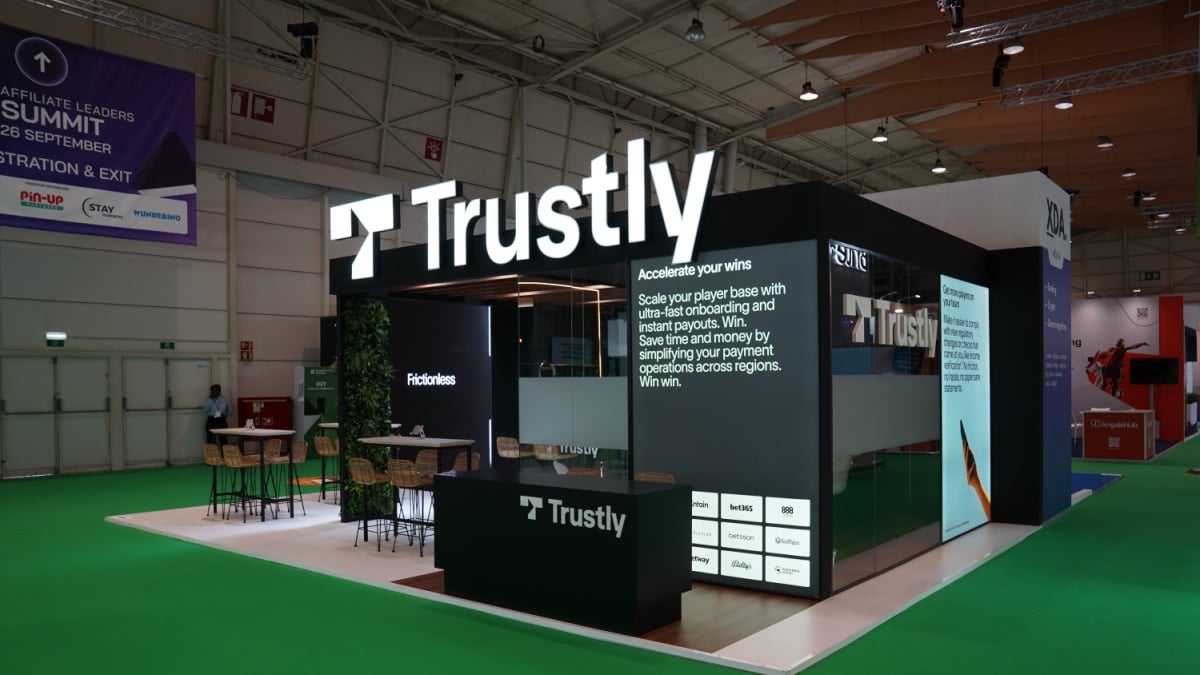
The new logo replaces the old shopping cart and lock for a bold ‘T’. The negative space in the ‘T’ depicts a forward arrow, representing how Trustly overcomes traditional payment pain points and keeps the payment process moving forward without interruption.
The new Trustly green is slightly lighter and supported and contrasted by secondary greens and tertiary purples, blues and greys.
It builds on Trustly’s growth since its formation in 2008 with it now having processed hundreds of millions of transactions, increased its geographical footprint to include Europe, North America and Australia and grown to serve more than 10,000 global merchants across an array of industries.
Oscar Berglund, CEO at Trustly, commented: “At Trustly, we know that the payments landscape is changing faster than ever, especially as Open Banking sweeps the world. As such, our products and services are constantly evolving to meet new demands and we’re excited to unveil the fresh face of Trustly, which will help take us forward into the next phase of our journey.
“The new logo is optimised for the checkout environment, so merchants will be able to present Trustly’s online banking payment option in a clear and distinct way, while consumers will still recognise the brand they know and trust.”